
The problem
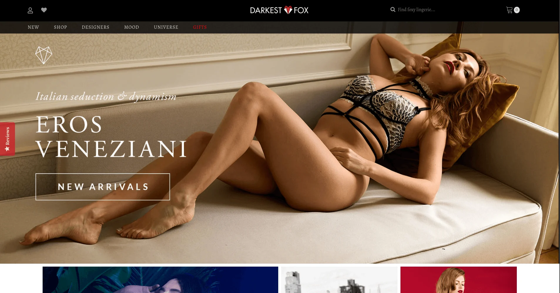
Darkest Fox is a luxury lingerie and lifestyle brand out of New York with a bold, editorial visual identity and a performance-conscious audience, exactly the kind of brand where a gimmick would do more damage than good. The mega-menu ran on a standard dropdown that didn’t showcase categories or featured collections well. There was no engaging way to capture newsletter signups. And the theme itself was carrying more weight than it needed to, slowing load times without adding anything the brand actually needed.
What I built
A mega-menu and homepage rebuilt from the ground up
I replaced the existing dropdown structure with a cleaner, more structured mega-menu that actually showcased categories and featured collections, rather than just listing links, alongside a homepage rebuild to match.
Gamified newsletter capture that still feels premium
I built a custom spin-the-wheel feature for newsletter capture, letting visitors spin for a discount in exchange for their email. It’s playful without breaking the brand’s upscale tone, and it measurably improved email capture rates over the standard signup form it replaced.
Performance work that didn’t touch the visual quality
I compressed and resized image assets, reduced unnecessary JavaScript, and refined the Liquid logic throughout the theme for better speed and scalability, landing on a 35% increase in site speed with smoother load times across mobile and desktop.
What actually changed
| What changed | Before | After |
|---|---|---|
| Mega-menu | Standard dropdown | Structured, showcases categories & collections |
| Newsletter capture | Standard signup form | Gamified spin-to-win wheel, higher engagement |
| Site speed | Baseline | 35% faster |
| Asset & JS handling | Bloated | Optimized, reduced frontend bloat |
The engagement
The goal throughout was clean, on-brand frontend improvements that didn’t compromise visual quality, and the result is a site that’s noticeably faster and more interactive while still reading as the same premium brand.